Victoria
Projected Values
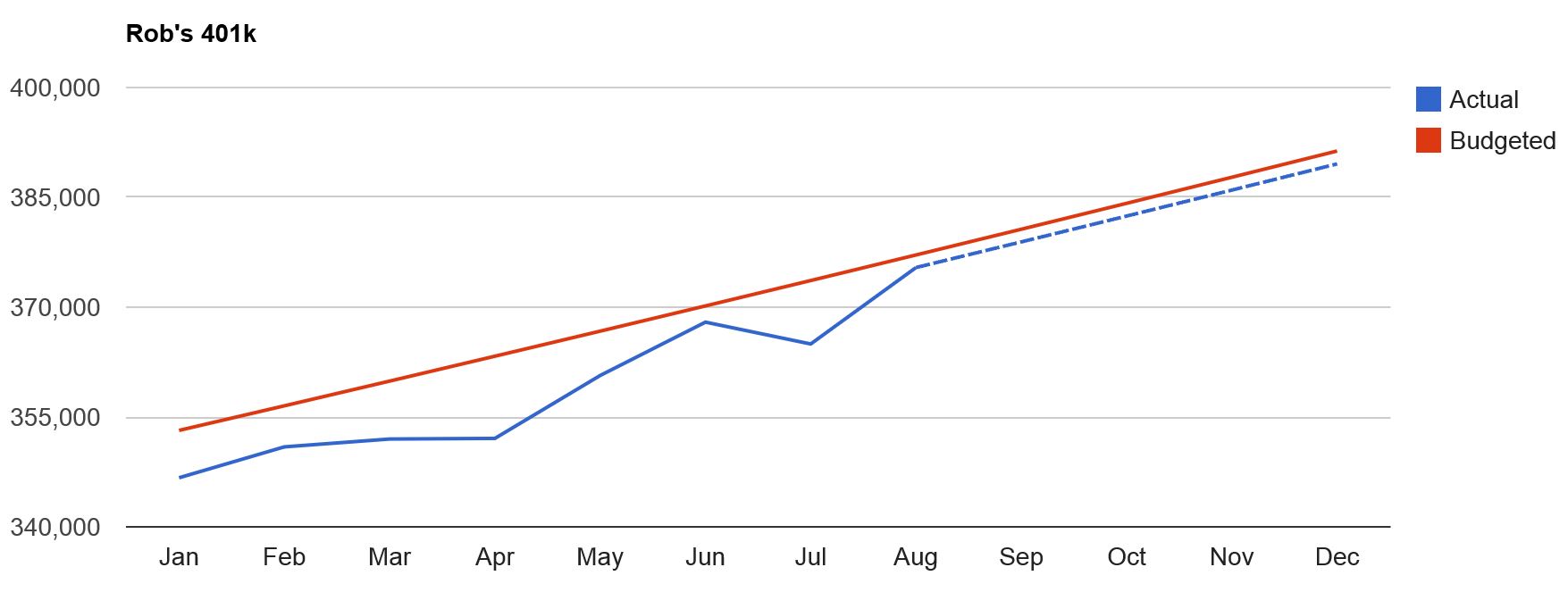
Chart View...
Throughout the pages in your new tool you will see projected values. This is done by two different methods: one represented
in charts and one in tables. The chart to the left is an example of a graphical representation you will see repeated throughout
your different views of data. The red line always shows the antcipated value based on what you have budgeted. The solid blue line
shows the actual resulting value based on your past transactional data imported. The blue dotted line shows the new projected values
based on past actuals and your future budget for that category or account. This is very useful information as you can see how past
discipline in budgeting can positively or negatively impact your future value. This also gives you the visibility needed to determine
how spending needs to change going forward to get back on track.
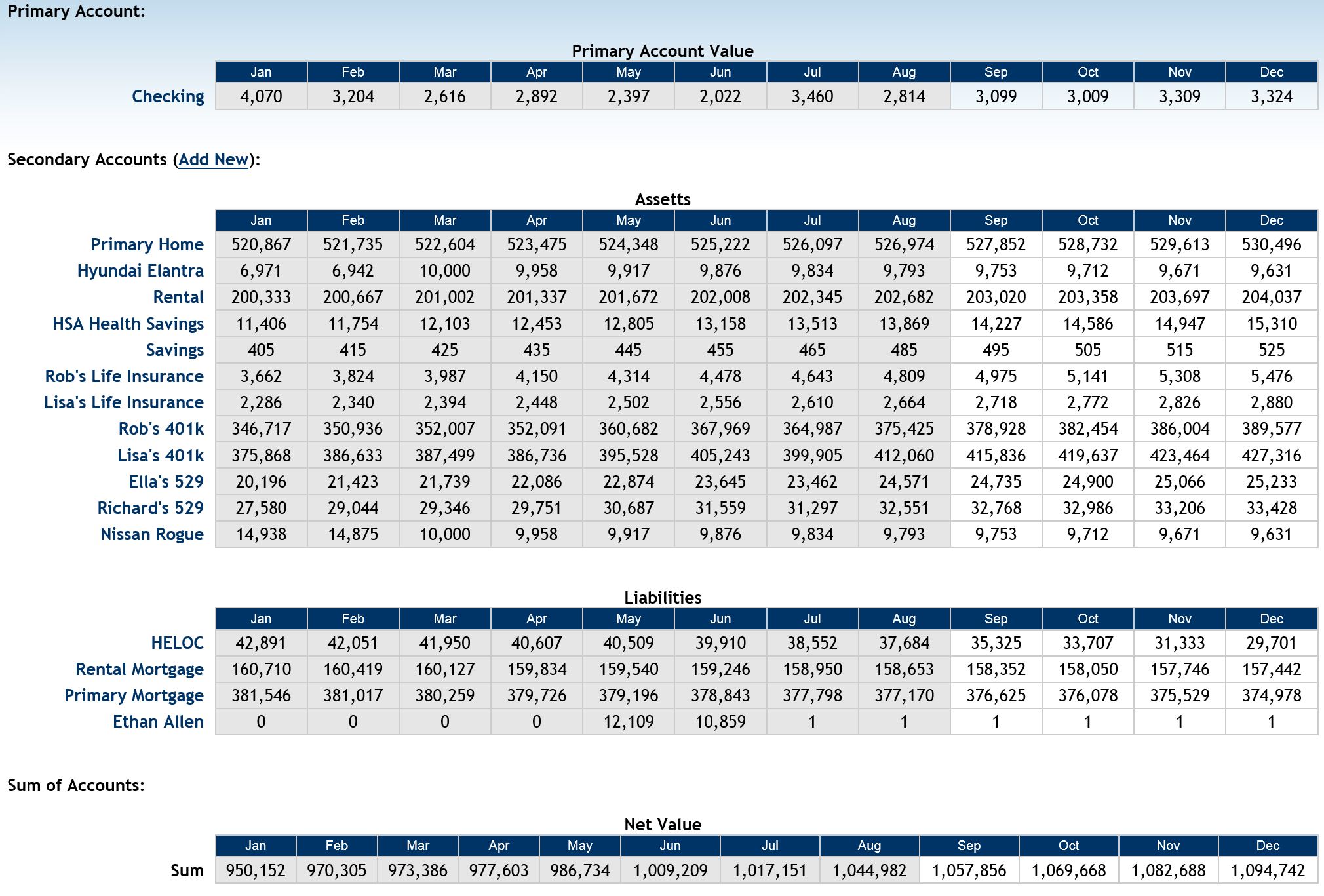 Table View...
The example to the right shows how table data is represented with actual and forecasted values. Anywhere you see the shaded data, this represents data from past months and is calculated using transactional data from those months. The non-shaded data is forecasted values based on past months actual transactional data and your budget for future months. The secondary account summary shown here is a great example of how you can see both your net worth and an individual account value change over the year.
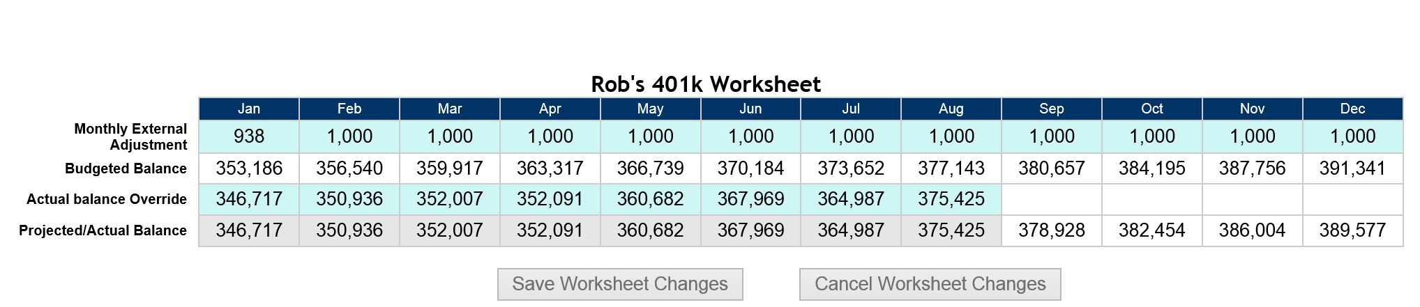
The example below shows the secondary account worksheet. This worksheet is dynamic and as you change the adjustment or override values (editable values are shaded in light blue) the projected and actual values will change accordingly. Create an account and start realizing the value of seeing a clear picture of not only yoour actual values in the past, but your projected values for the next 1 to 2 years!